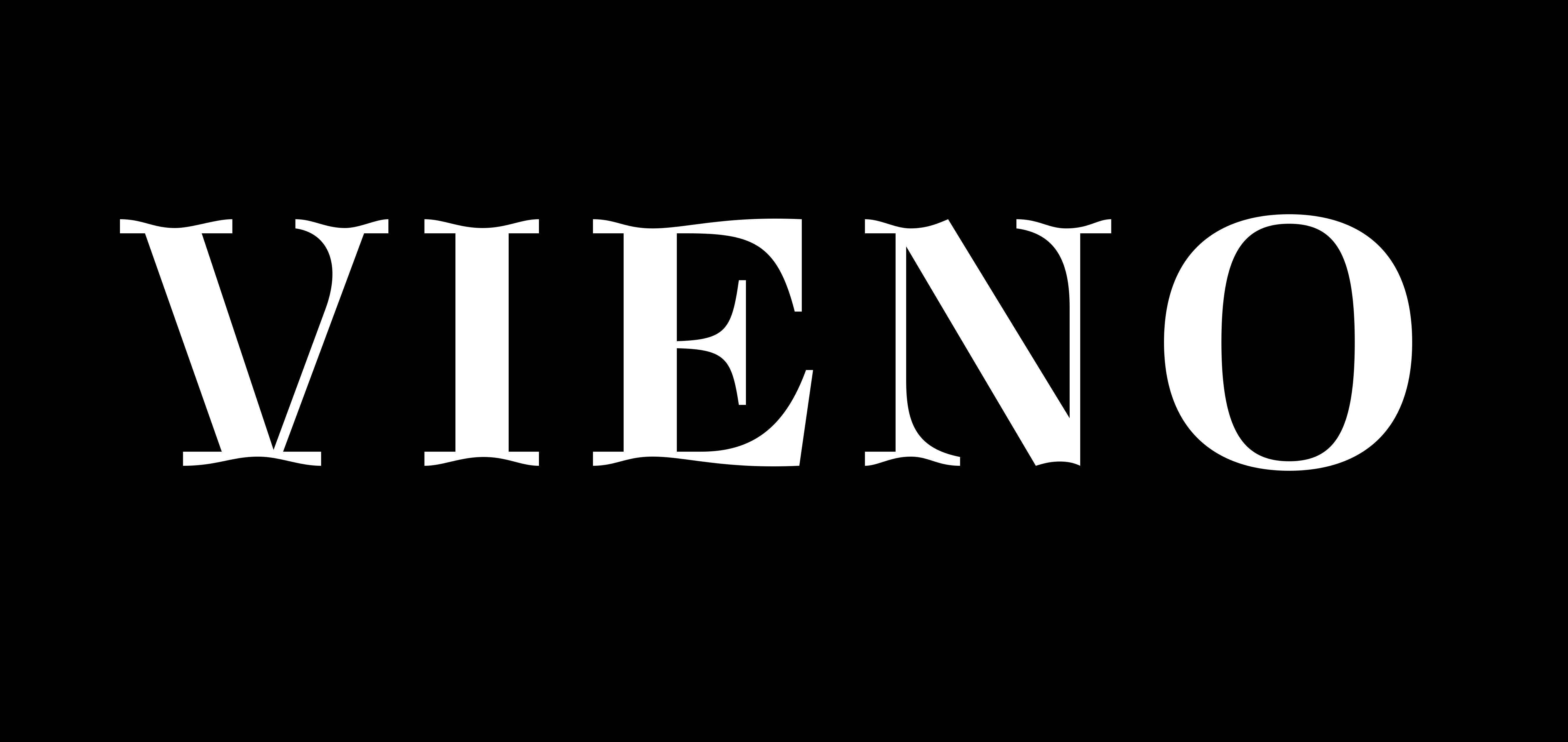
Vieno
Work in Progress
Version 0.4
Beta releases available
via FutureFonts
Vieno
Work in Progress
Version 0.4
Beta releases available
via FutureFonts
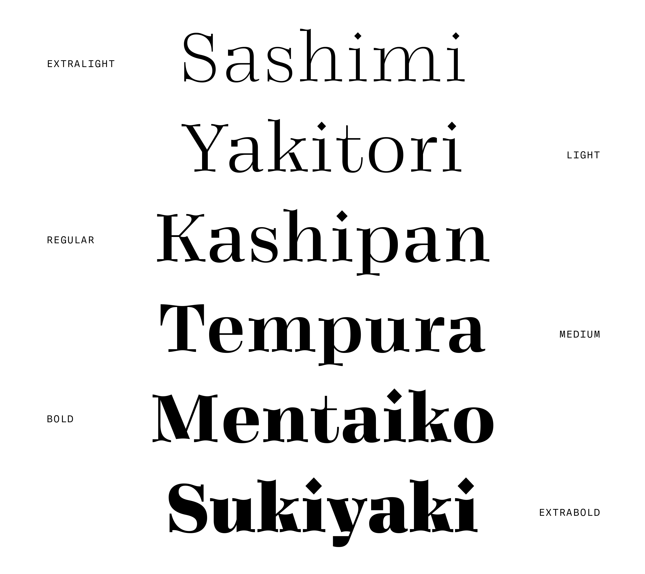
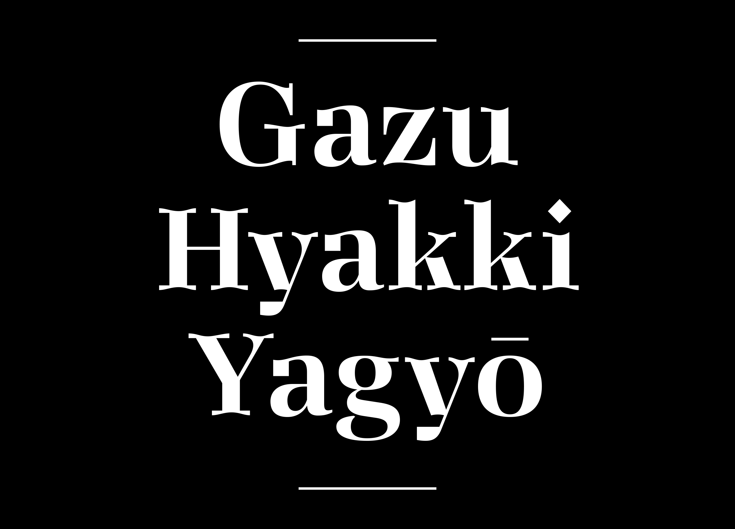
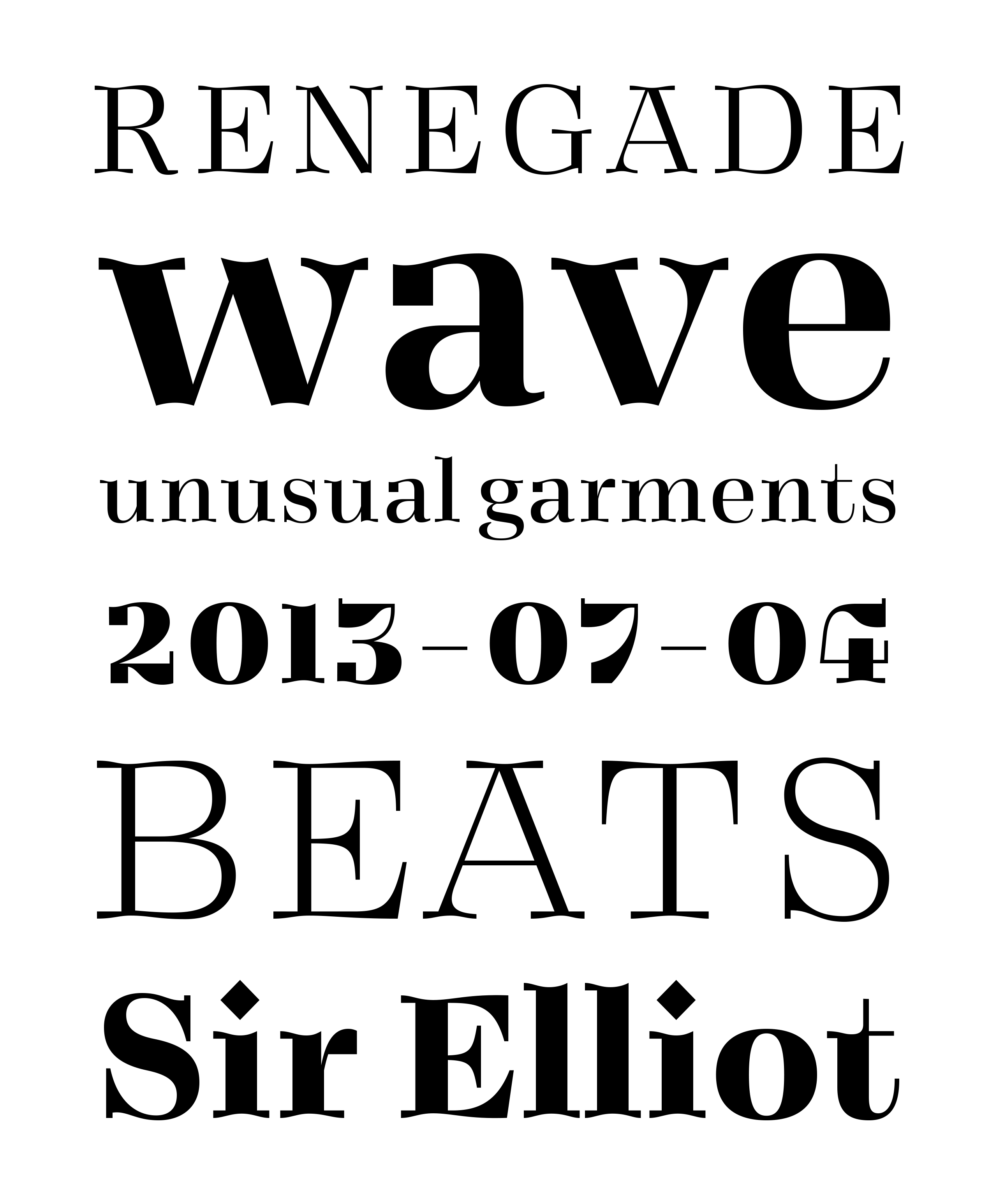
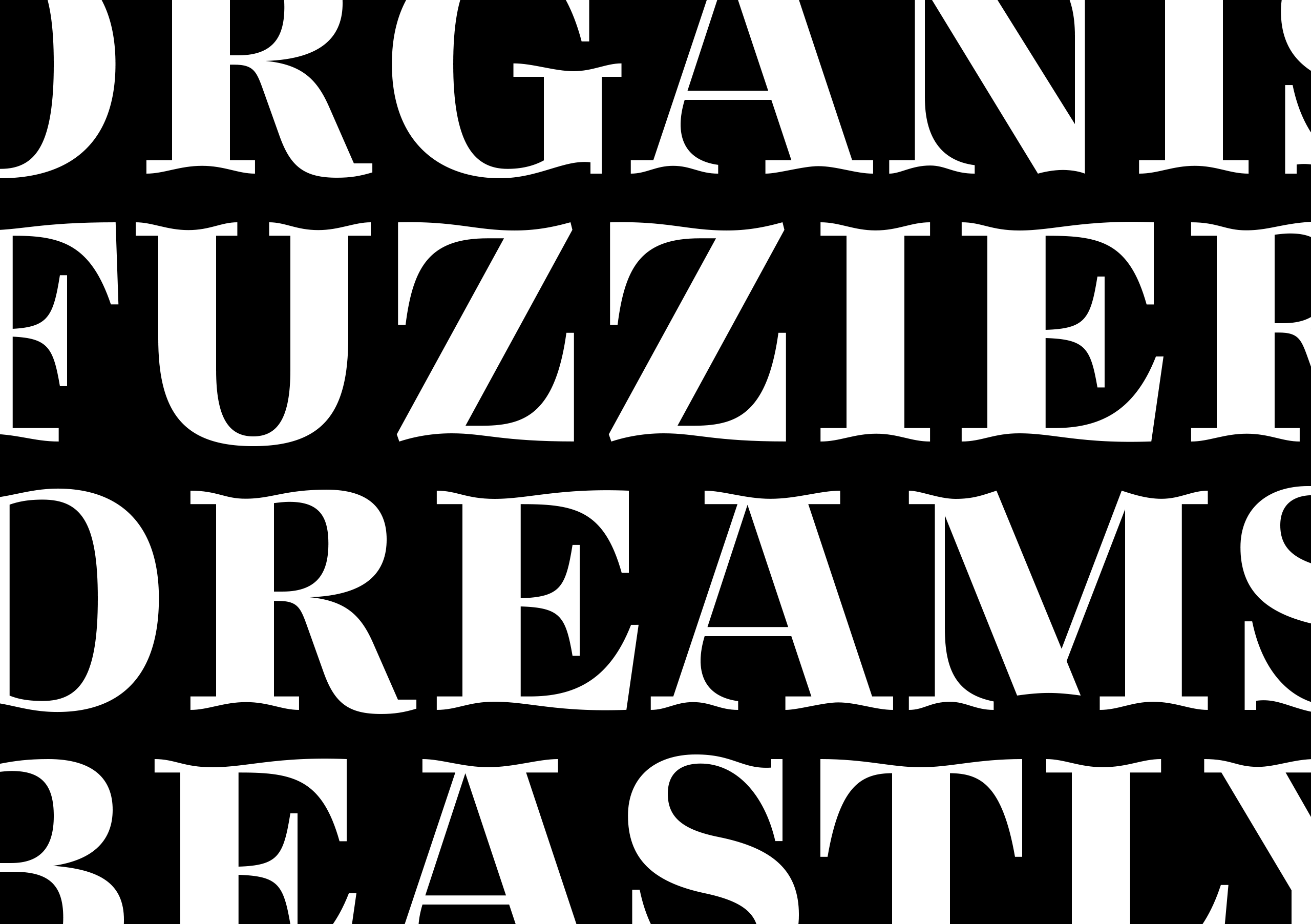
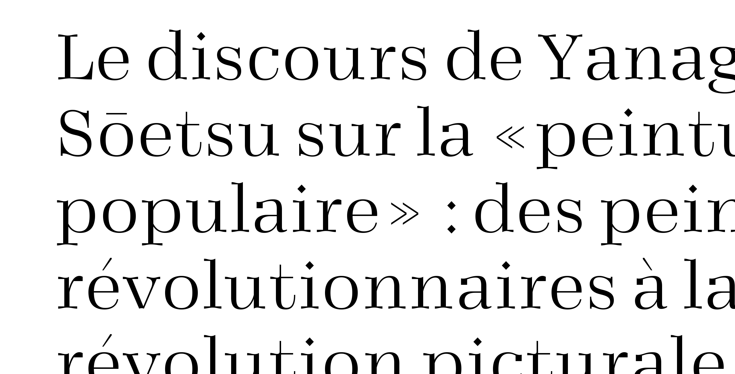
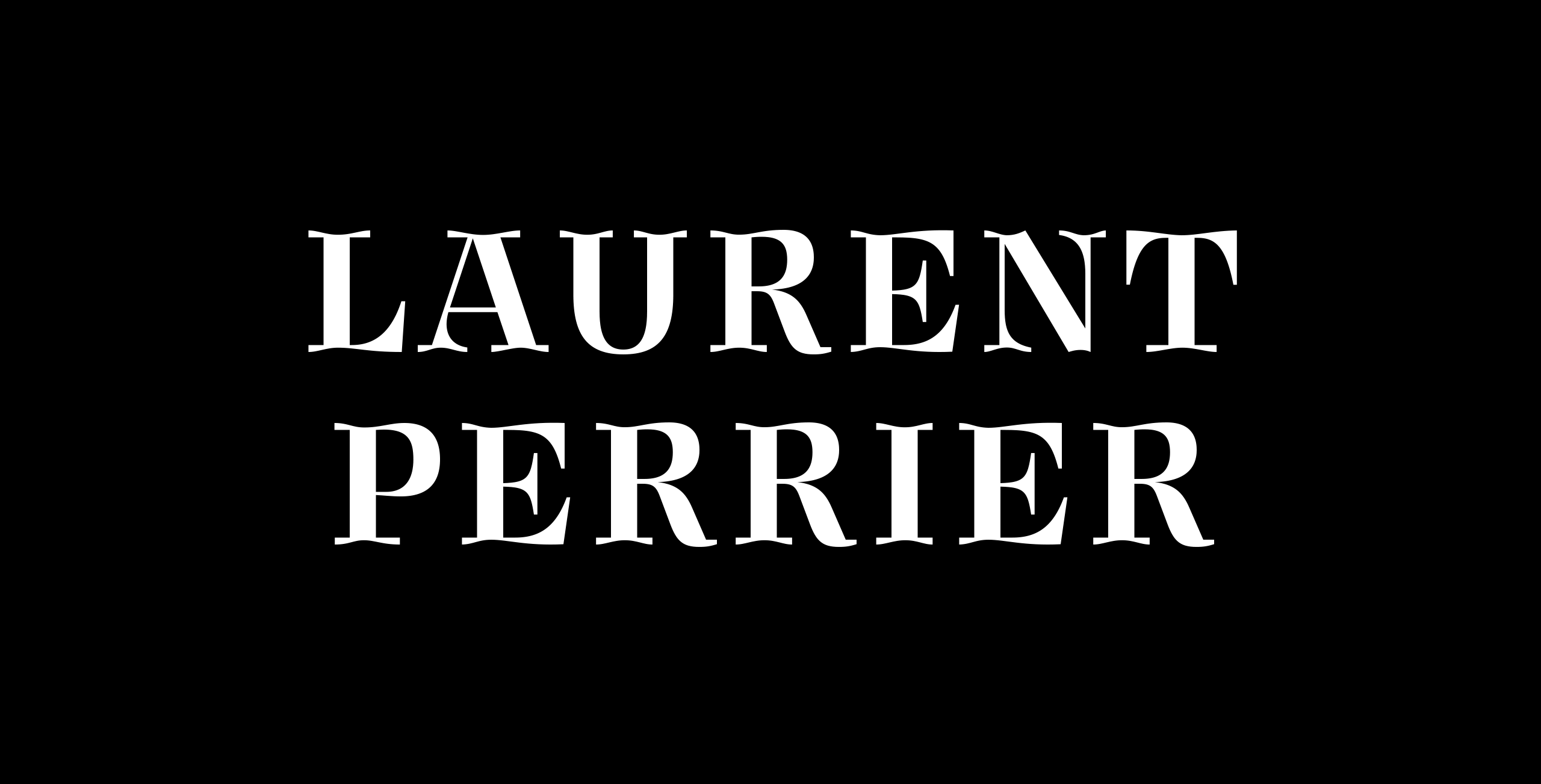
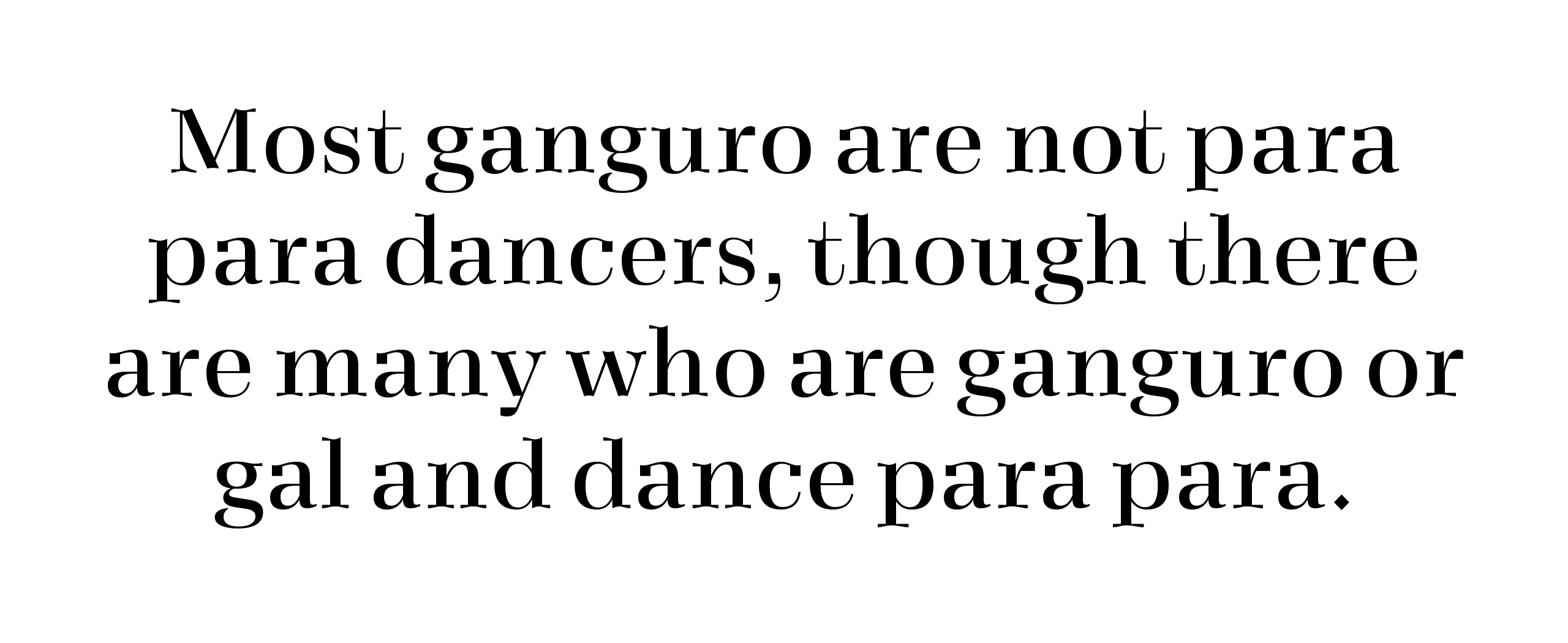
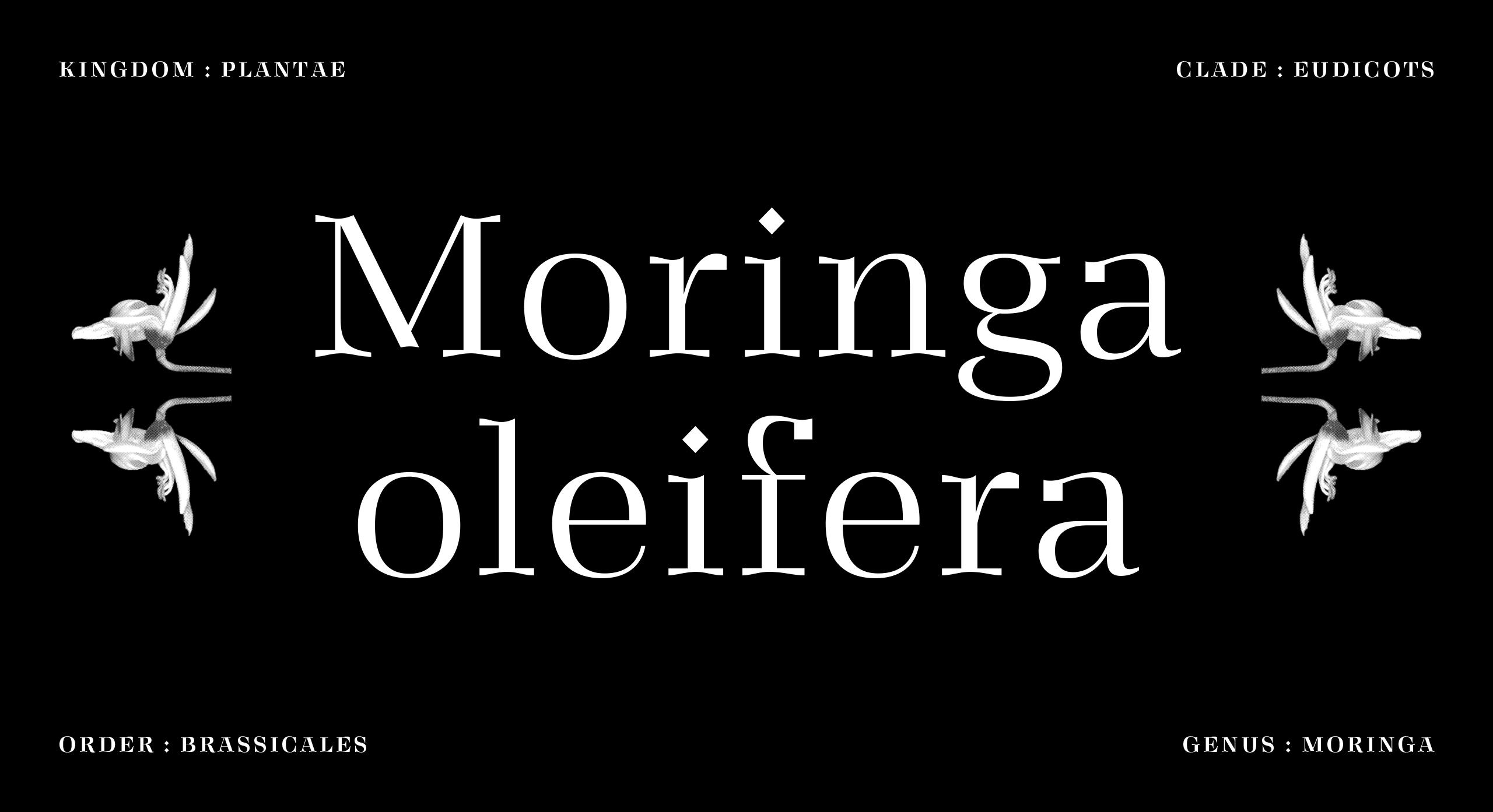
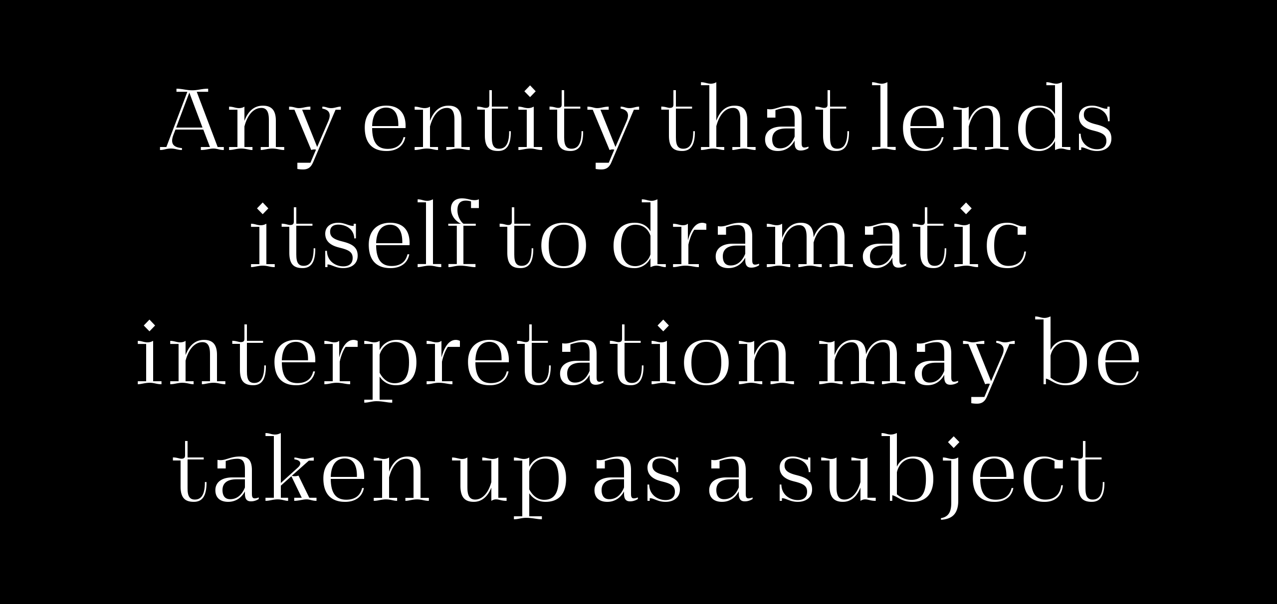
The goal in designing Vieno was to modernise classically elegant shapes so that the the end result would be an up to date typeface combining old and new design elements. The typeface has its roots solidly in tradition but with a bold and modern execution.
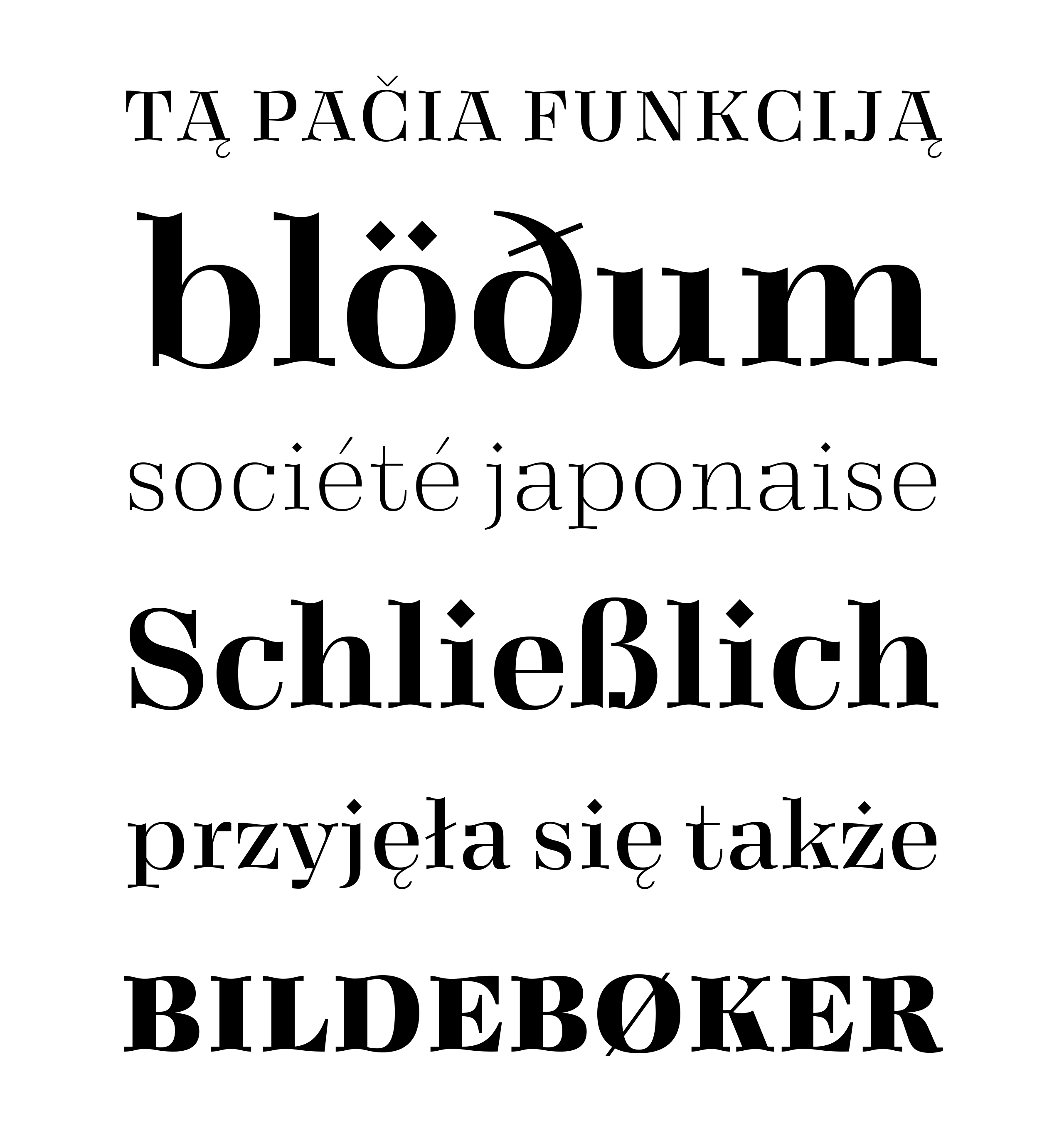
Vieno plays with the juxtaposition of classical proportions and contrast, organic shapes and rough mechanical details. The design combines elements that feel conventional and clear those that are surprising and slightly out of place. Great care was given in making these contrasting elements work together in a harmonised whole.
The goal in designing Vieno was to modernise classically elegant shapes so that the the end result would be an up to date typeface combining old and new design elements. The typeface has its roots solidly in tradition but with a bold and modern execution.
Vieno plays with the juxtaposition of classical proportions and contrast, organic shapes and rough mechanical details. The design combines elements that feel conventional and clear those that are surprising and slightly out of place. Great care was given in making these contrasting elements work together in a harmonised whole.

CONTACT
teo@teotuominen.com
+358 503005654
CONTACT
teo@teotuominen.com
+358 503005654
CONTACT
teo@teotuominen.com
+358 503005654
CONTACT
teo@teotuominen.com
+358 503005654
SECTIONS
Retail Fonts
Custom Fonts
About