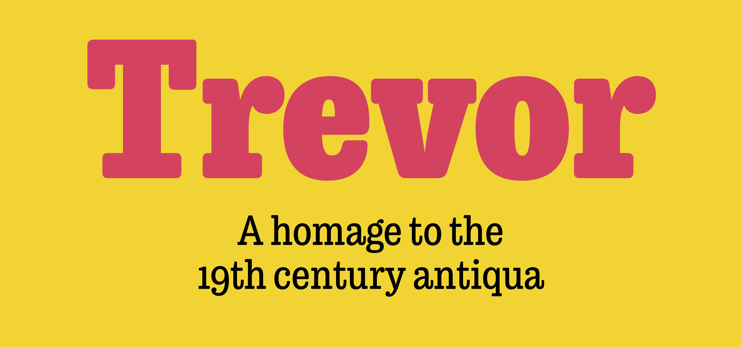
Trevor
Retail typeface
Available via TypeTogether
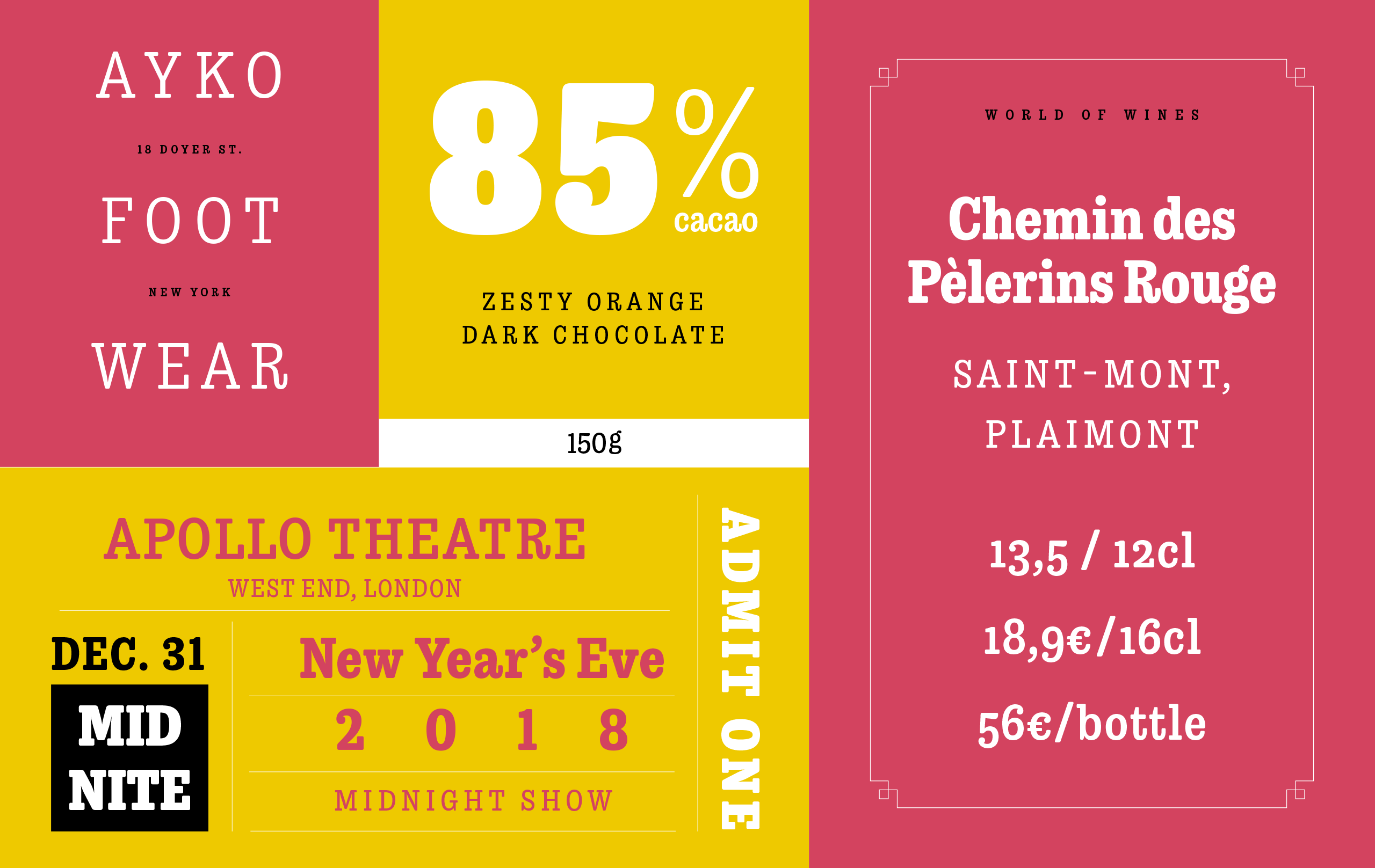
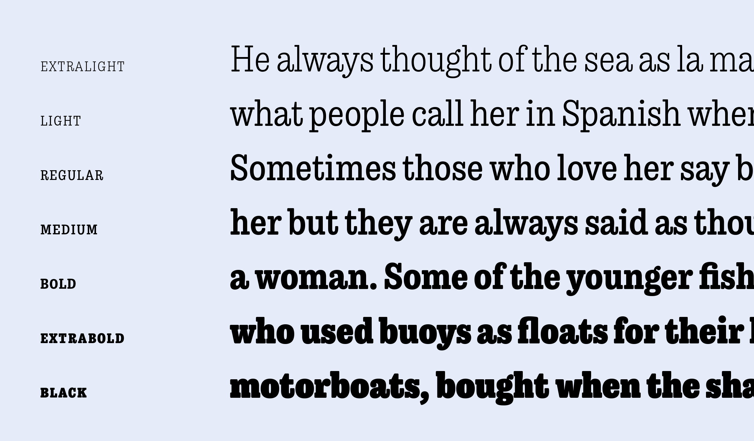
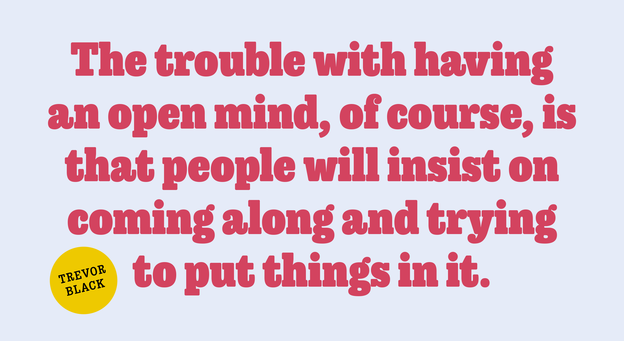
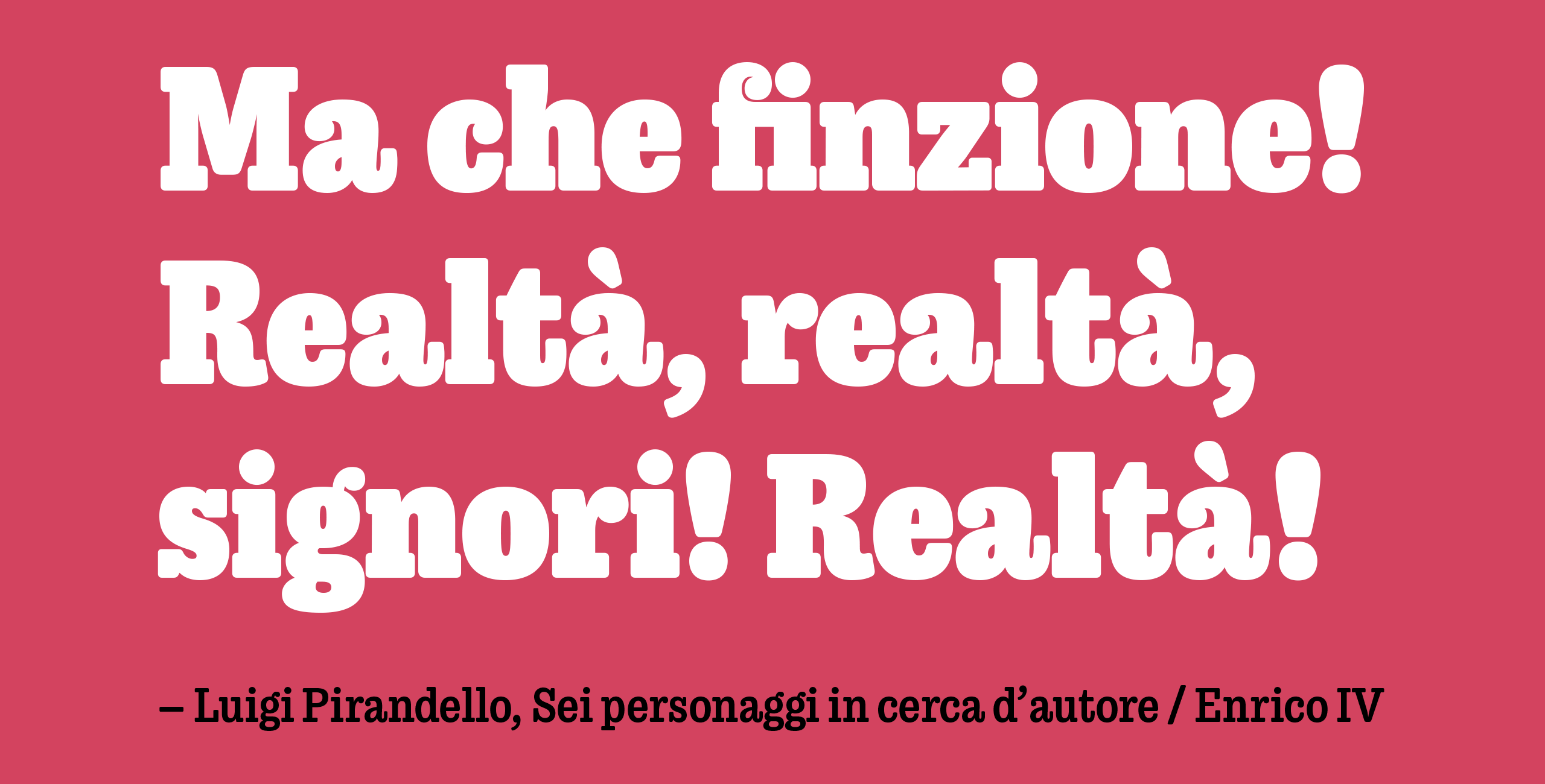
Trevor is an affable slab serif in nature: both heavy and kind. Known for their familiarity and their dark colour, the terminals of slab serifs put additional weight along the line to maintain an inky presence. Their clunky forms reveal slight immaturity and arouse the reader’s sympathy for the subject at hand. Trevor connects with others by consciously riding the line between being personal and commanding.
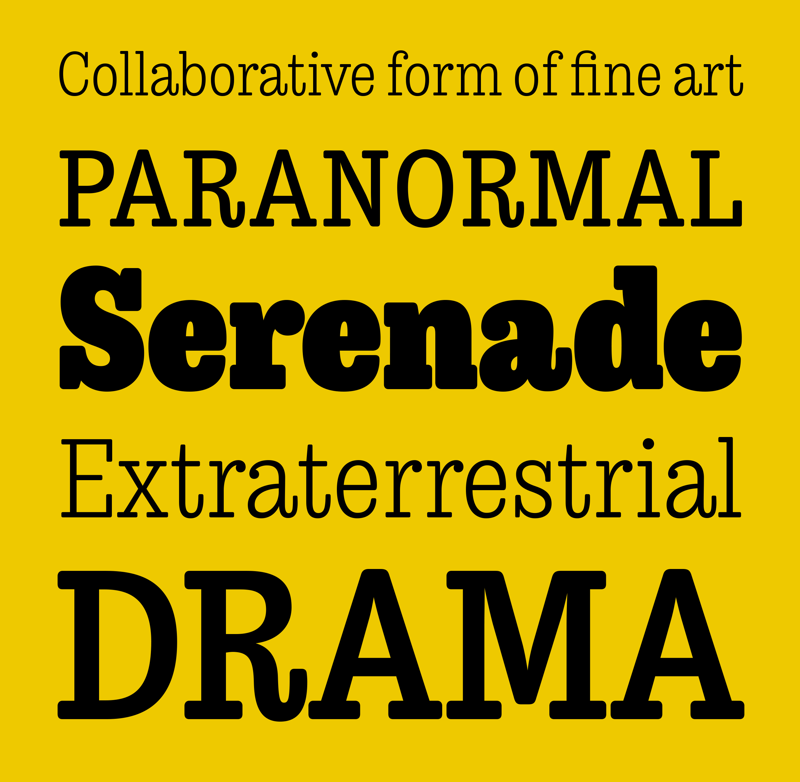
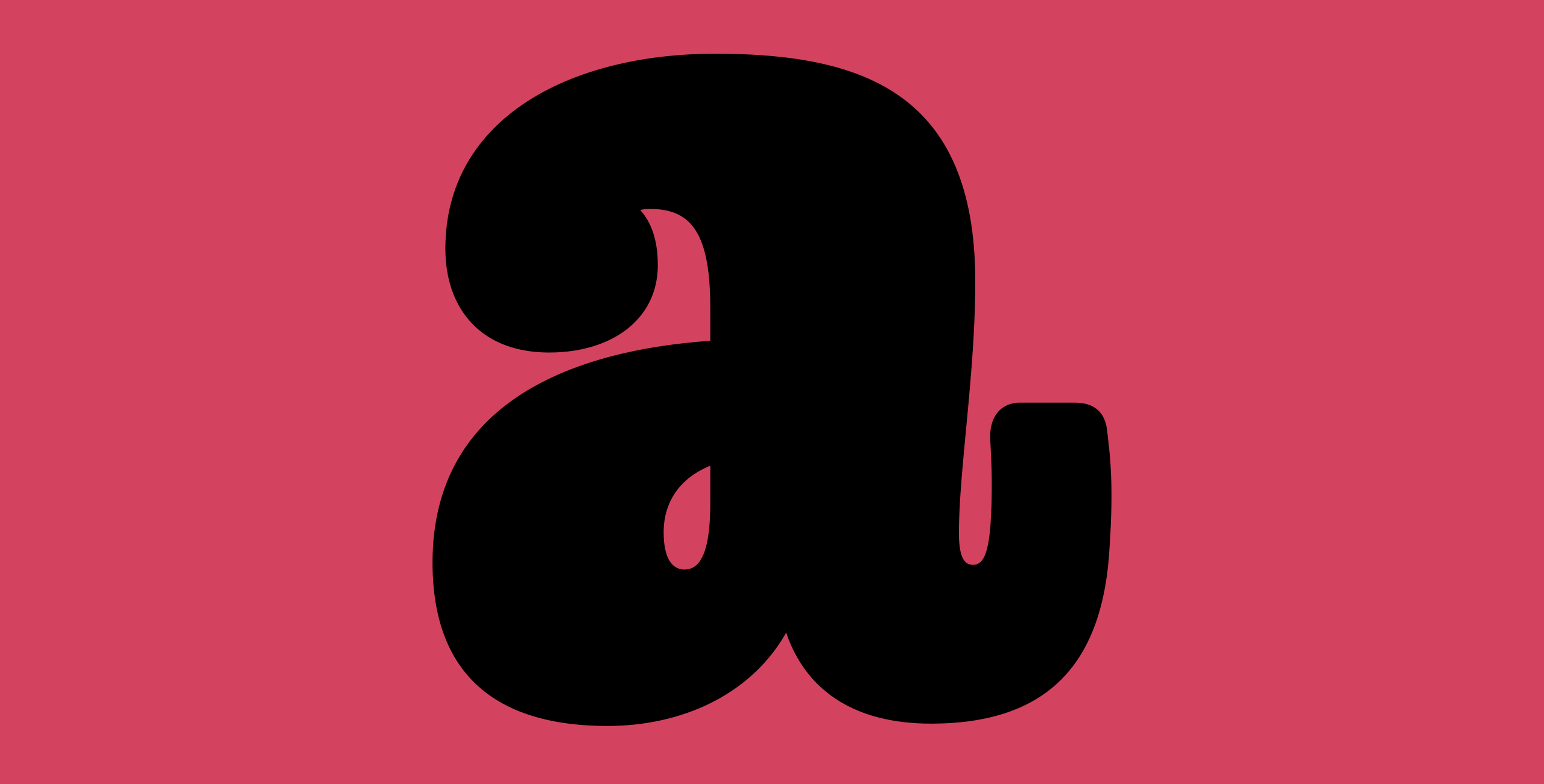
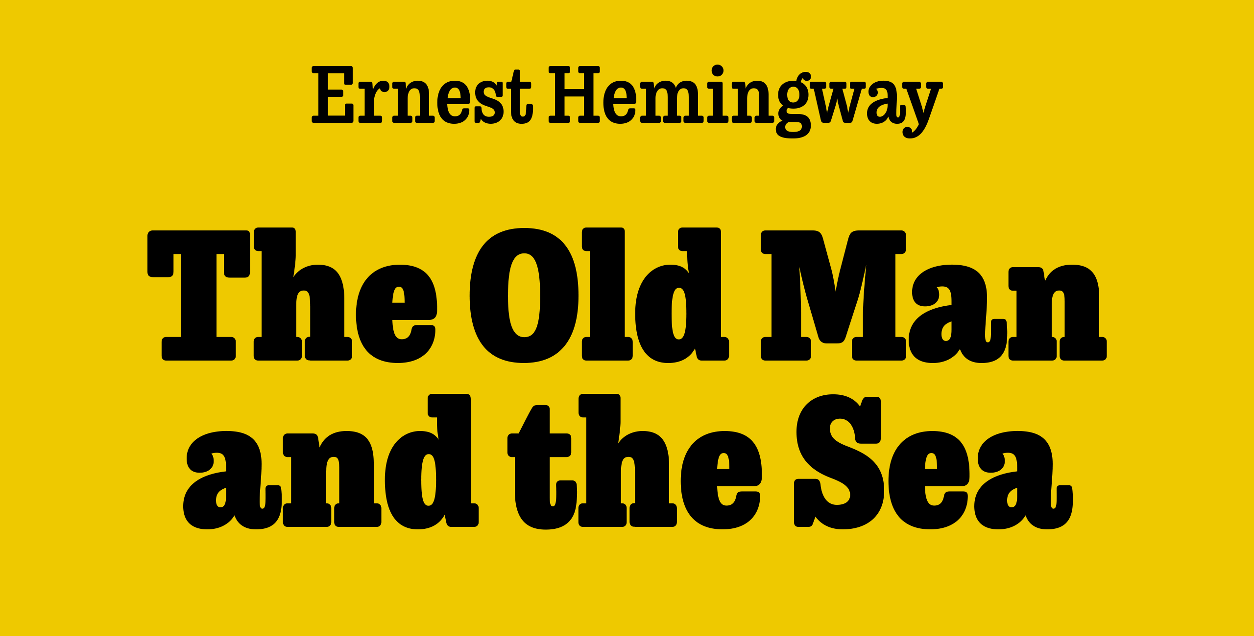
One goal with Trevor was to pair the robust nature of a low contrast slab serif with more sophisticated elements, such as the ball terminals. So wherever one looks in Trevor, rounded corners rule the day, softening the overall appearance by mimicking ink spread made by old metal type. The easygoing look is tempered by very few inktraps and sharp corners, mostly to the inside of characters and in acute angles.
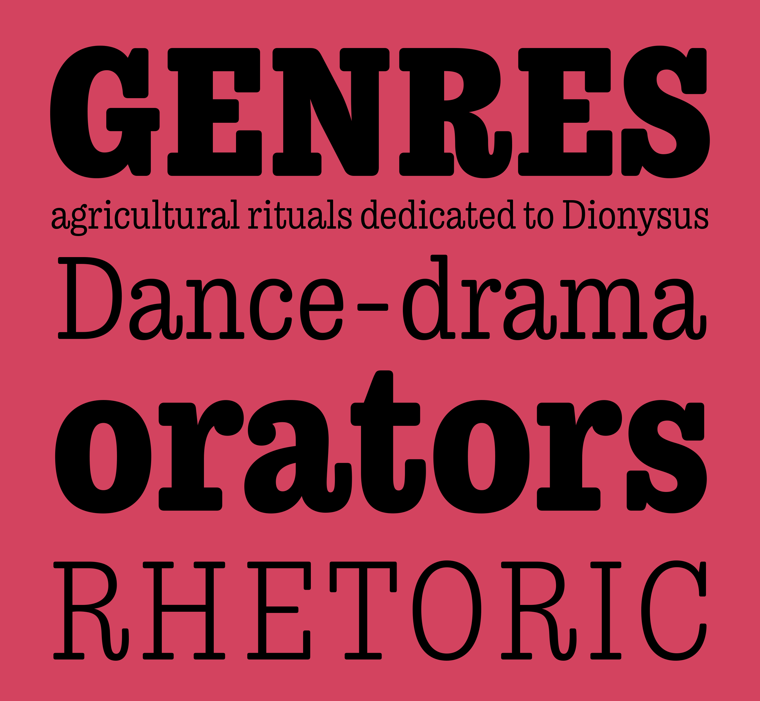
Trevor originally began as a revival of an unidentified typeface used in a dutch version of the play Tartuffe by Moliére. Because of the typefaces obscurity I had to make many design decisions without the use of an existing model.
These design decisions combined with a modern range of weights make Trevor an interpretation or homage to 19th century antiquas that’s been modernised for today’s users.
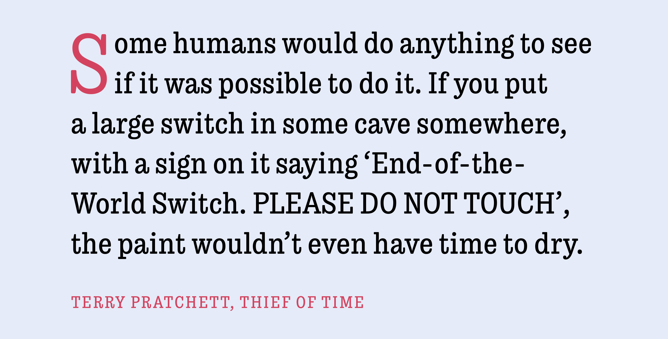
The low contrast combined with subtle rounding in the corners give Trevor a voice that’s both friendly and commanding at the same time. Some idiosyncrasies and design oddities give the otherwise modern typeface a slightly vintage flavour.
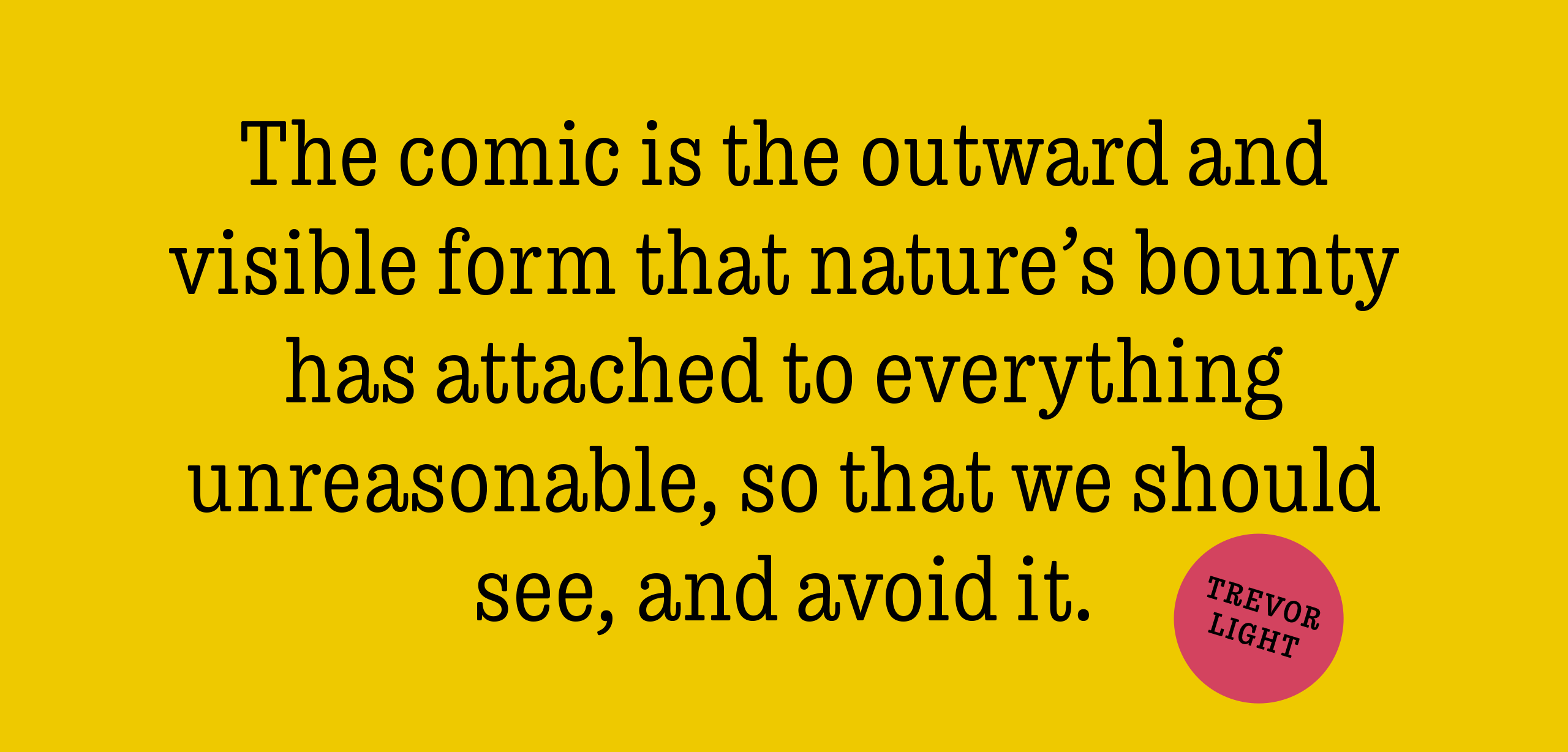
Trevor is an affable slab serif in nature: both heavy and kind. Known for their familiarity and their dark colour, the terminals of slab serifs put additional weight along the line to maintain an inky presence. Their clunky forms reveal slight immaturity and arouse the reader’s sympathy for the subject at hand. Trevor connects with others by consciously riding the line between being personal and commanding.
One goal with Trevor was to pair the robust nature of a low contrast slab serif with more sophisticated elements, such as the ball terminals. So wherever one looks in Trevor, rounded corners rule the day, softening the overall appearance by mimicking ink spread made by old metal type. The easygoing look is tempered by very few inktraps and sharp corners, mostly to the inside of characters and in acute angles.
CONTACT
teo@teotuominen.com
+358 503005654
CONTACT
teo@teotuominen.com
+358 503005654
CONTACT
teo@teotuominen.com
+358 503005654
CONTACT
teo@teotuominen.com
+358 503005654
SECTIONS
Retail Fonts
Custom Fonts
About