Paradise Series
Lettering
Creative direction & Packaging Design by Macwell Creative
Paradise Series
Lettering
Creative direction & Packaging Design by Macwell Creative
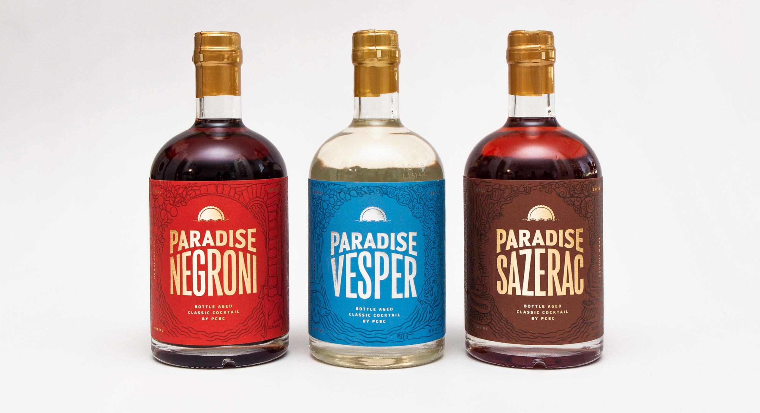
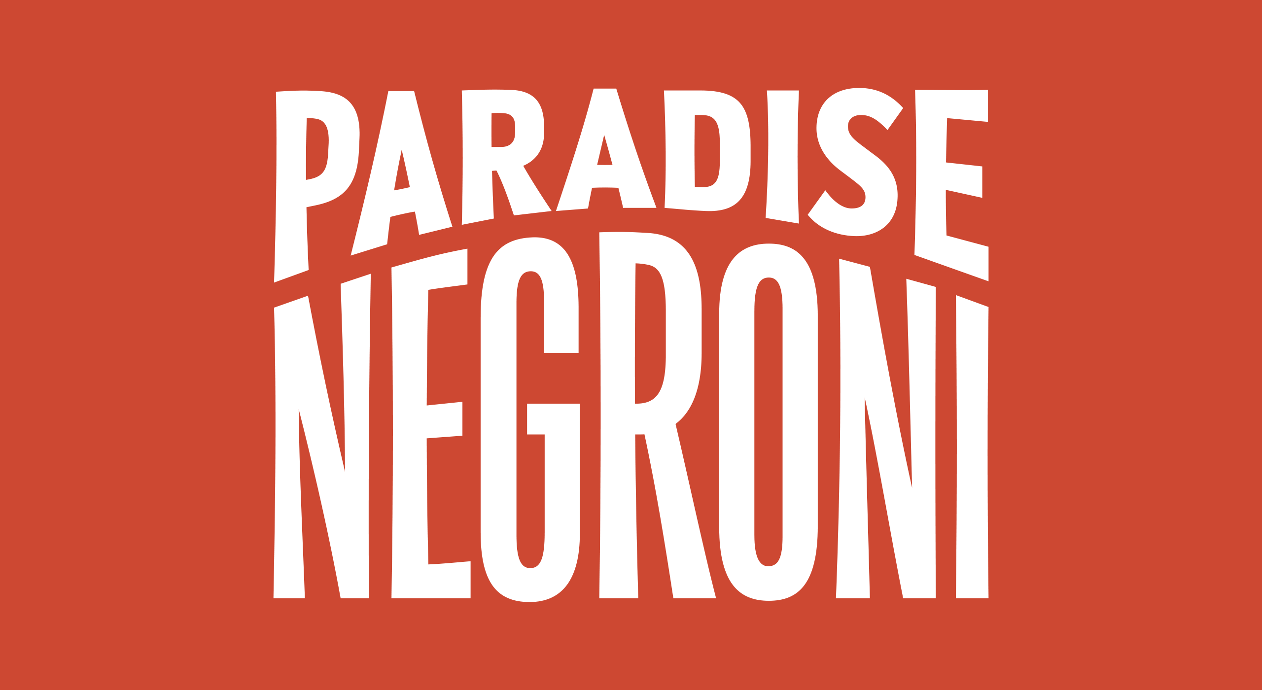
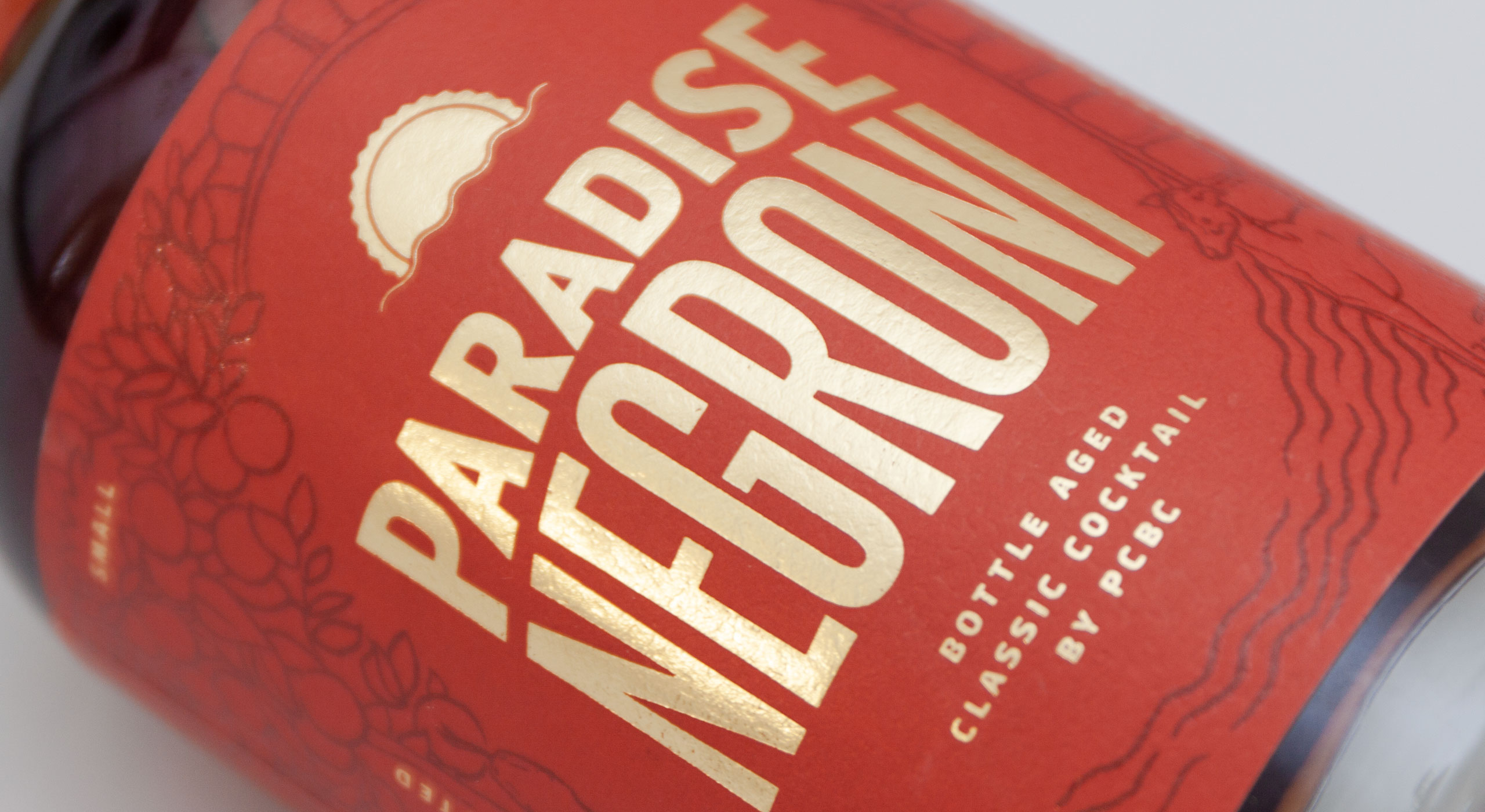
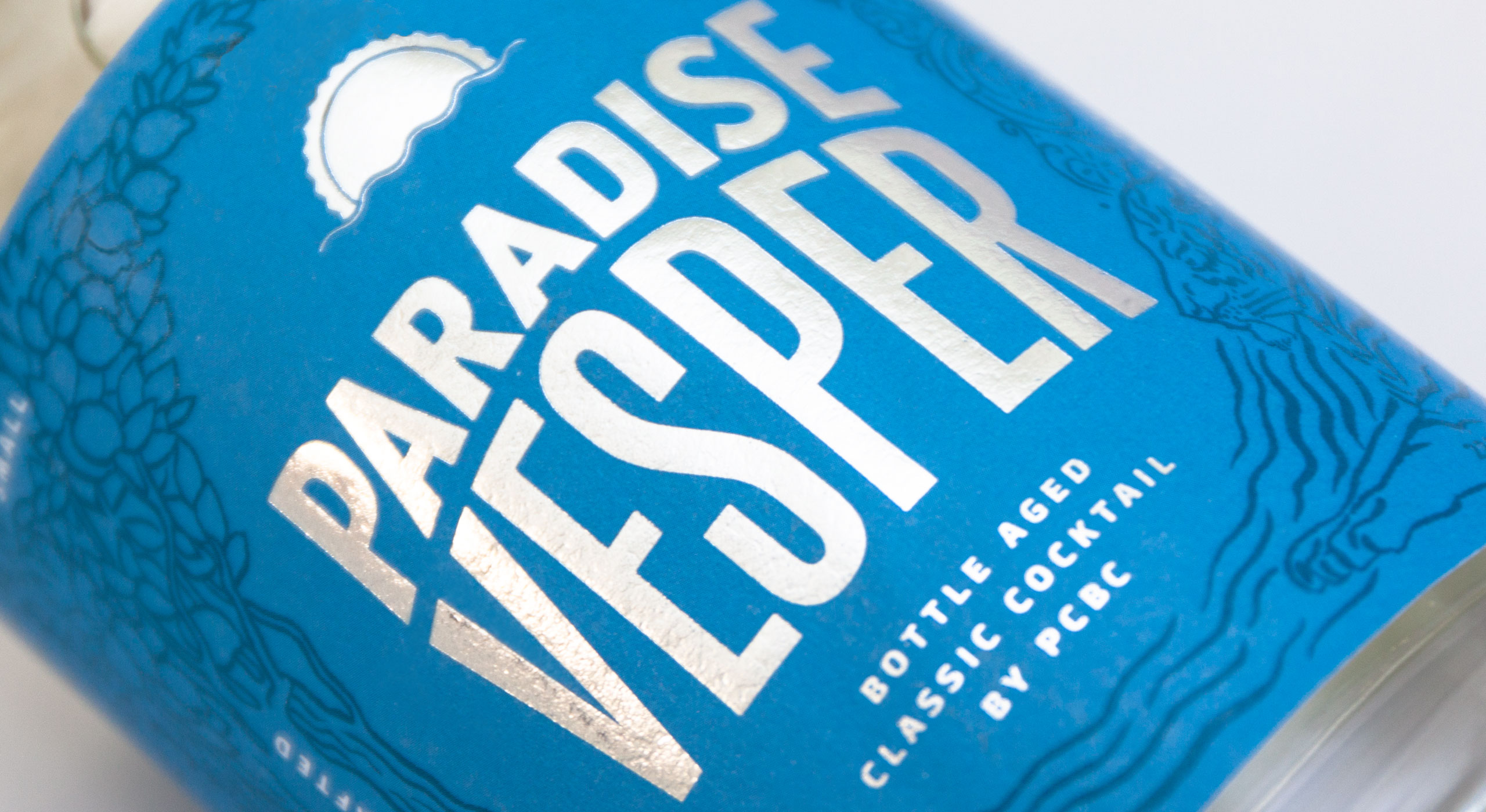
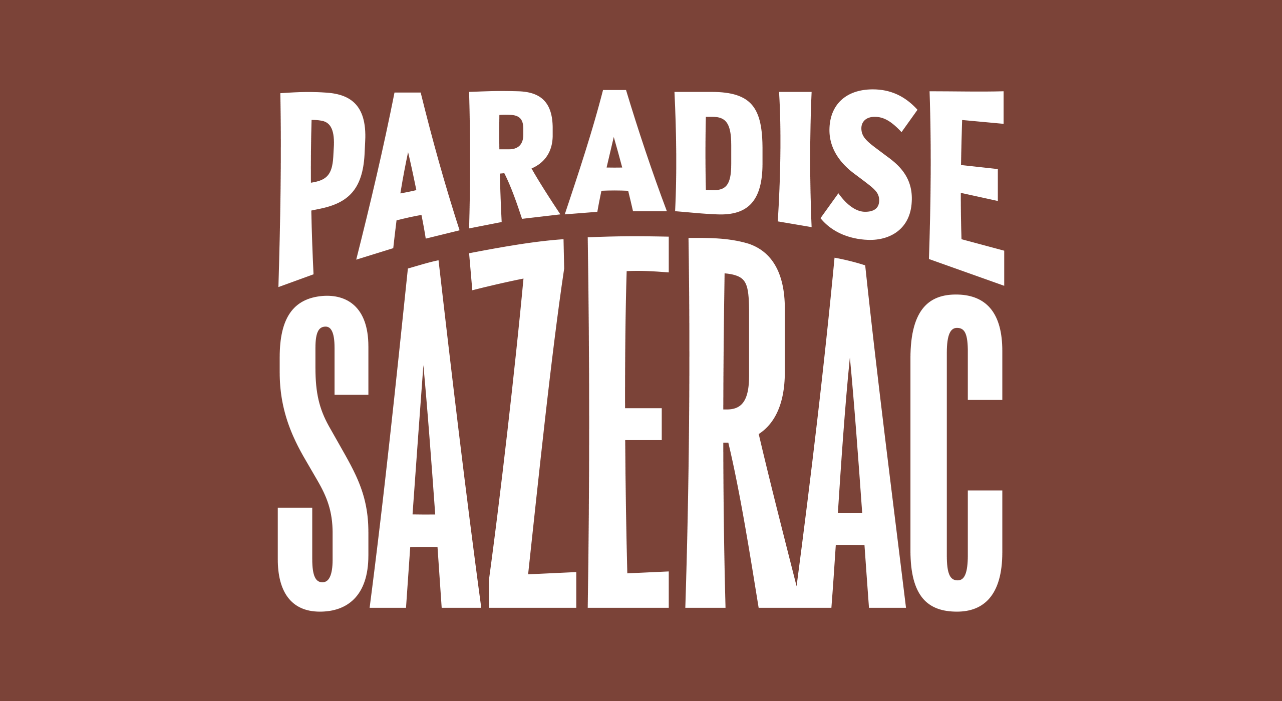
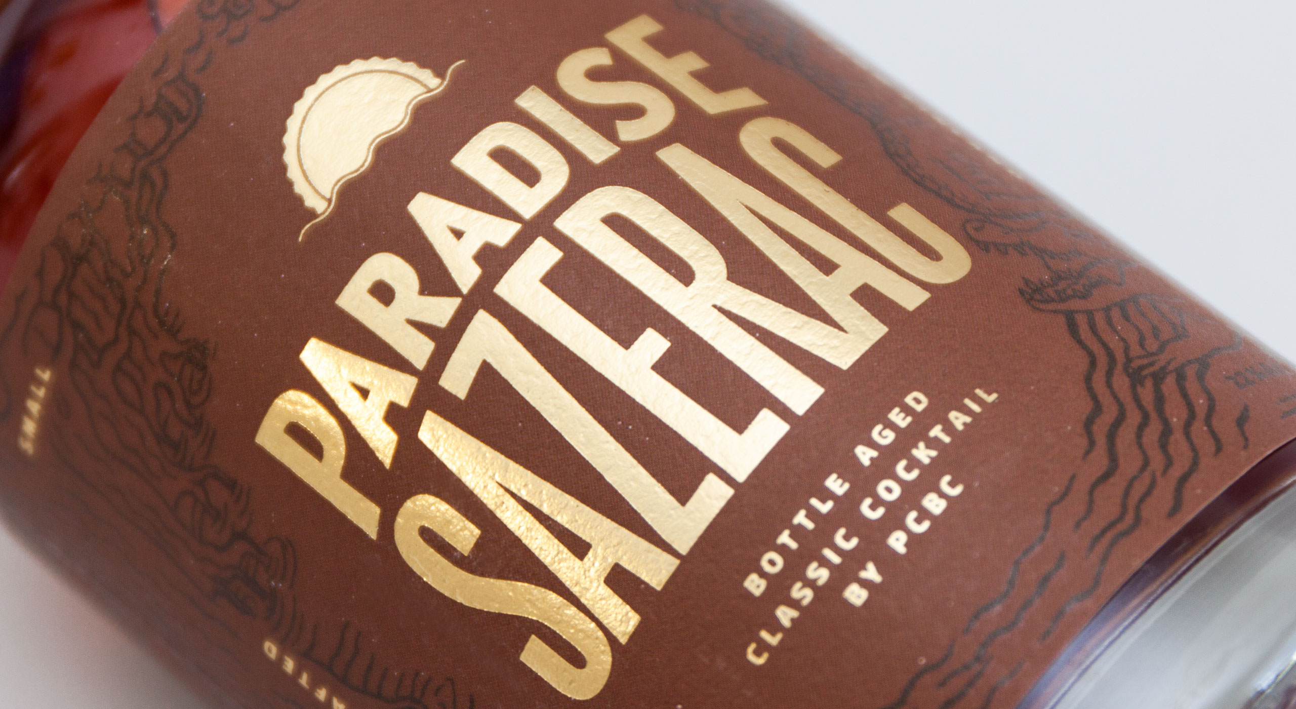
Title lettering for three bottled cocktails by Paradise City Beverage Company. The style needed to be strong, clear and consistent throughout the product line with the possibility of expanding to new products. It also needed to fit with the surrounding illustration.
The condensed sans serif lettering is made livelier by the arch that splits the words as well as a subtle concaveness in the straight shapes.
The lettering is combined with Paradise Sans, a custom typeface I designed for PCBC
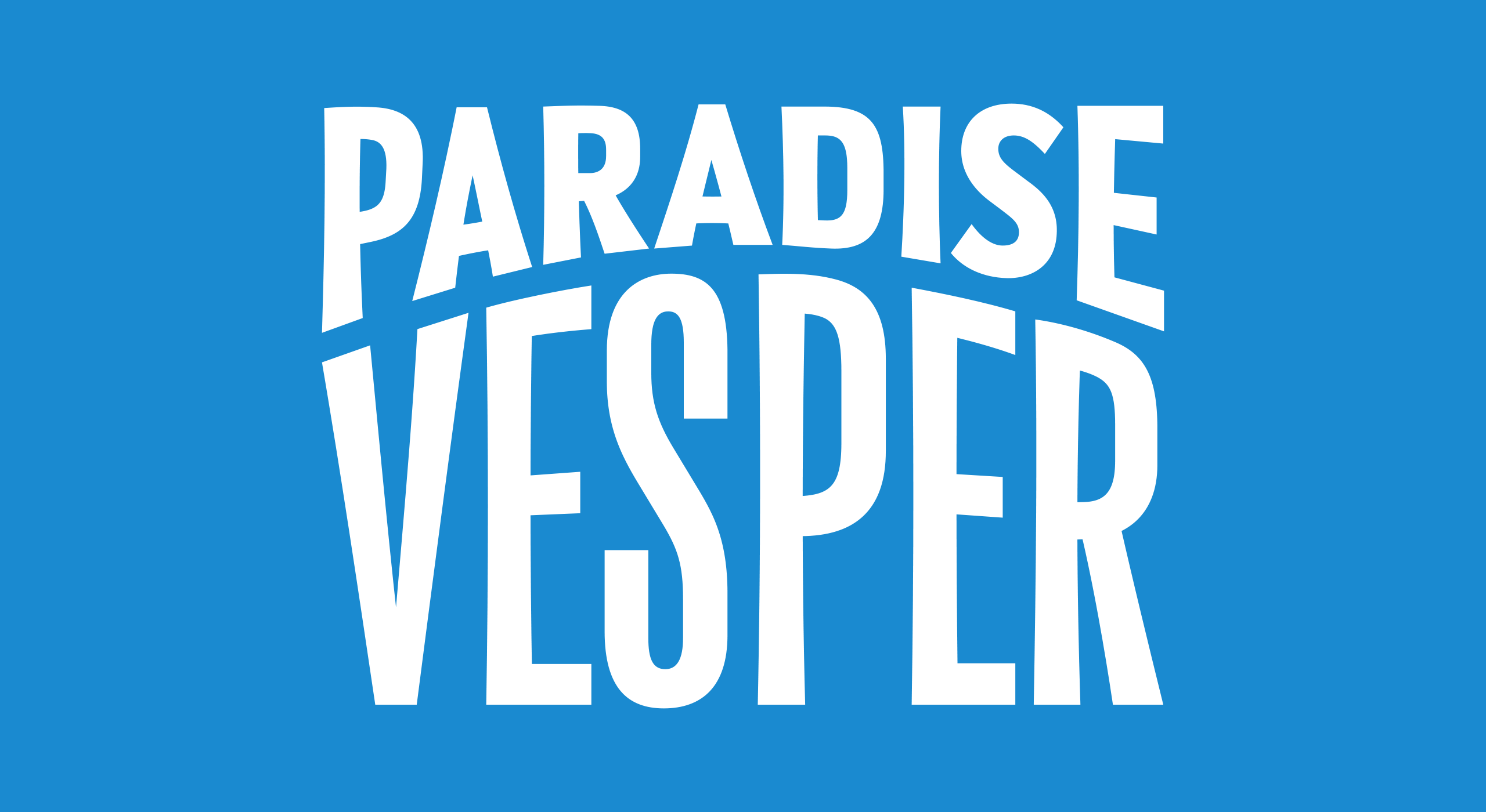
CONTACT
teo@teotuominen.com
+358 503005654
CONTACT
teo@teotuominen.com
+358 503005654
CONTACT
teo@teotuominen.com
+358 503005654
CONTACT
teo@teotuominen.com
+358 503005654
SECTIONS
Retail Fonts
Custom Fonts
About