Fazer Sans
Custom Typeface
Collaboration with
Emil & Erik Bertell
Art Direction:
Pentagon Design
Fazer Sans
Custom Typeface
Collaboration with
Emil & Erik Bertell
Art Direction:
Pentagon Design
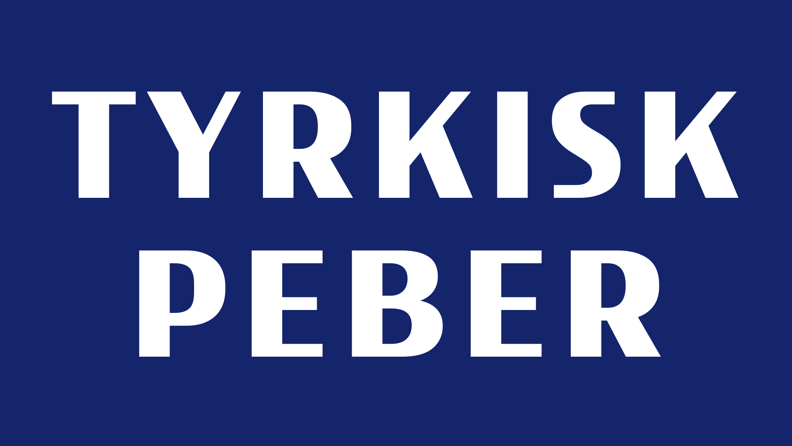
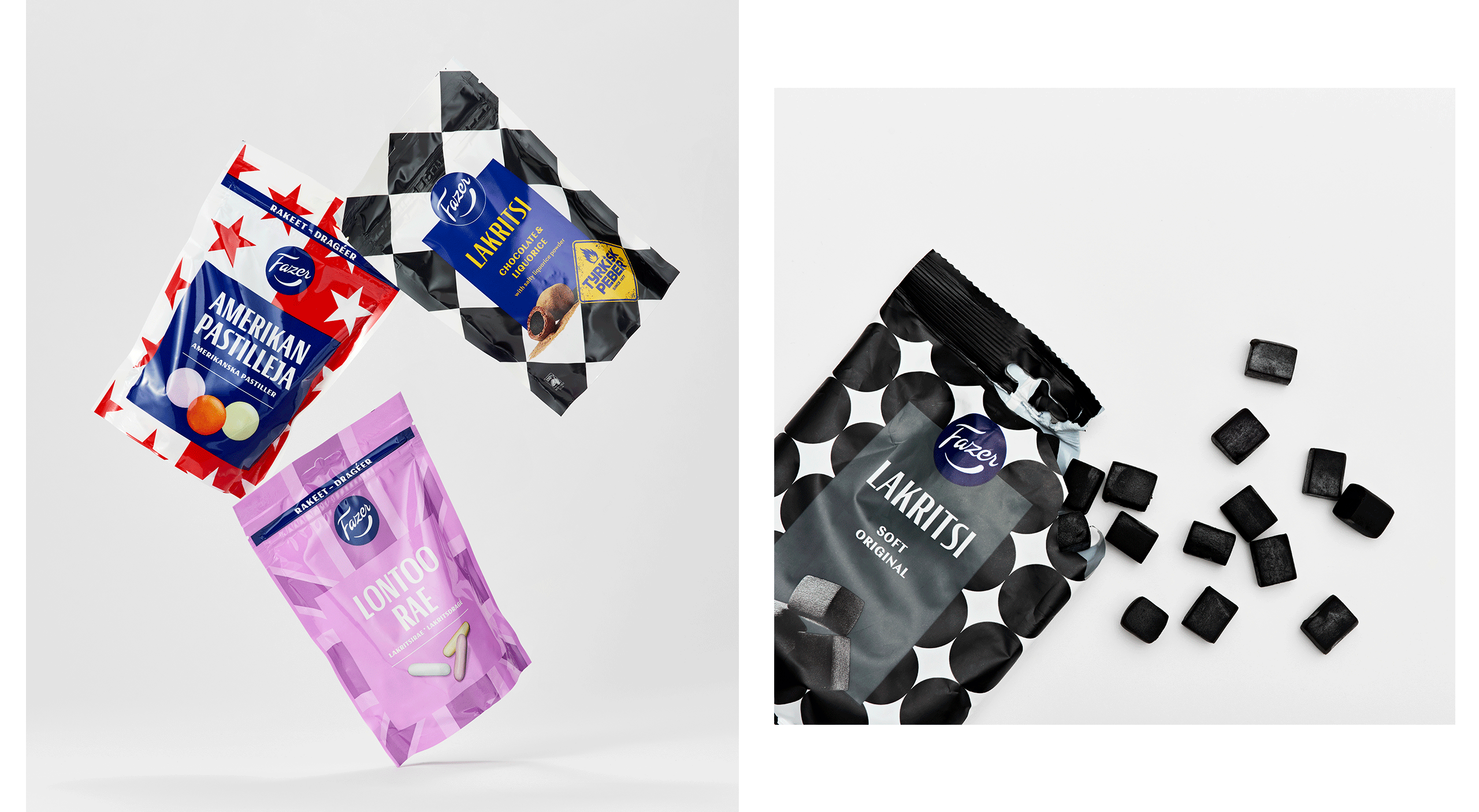
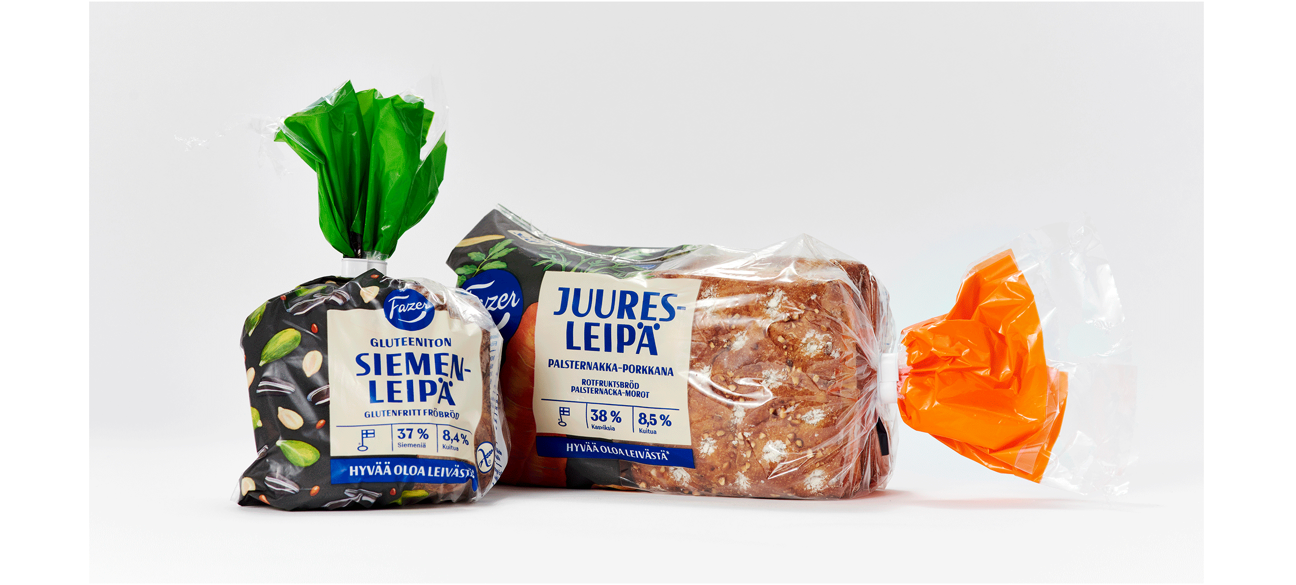
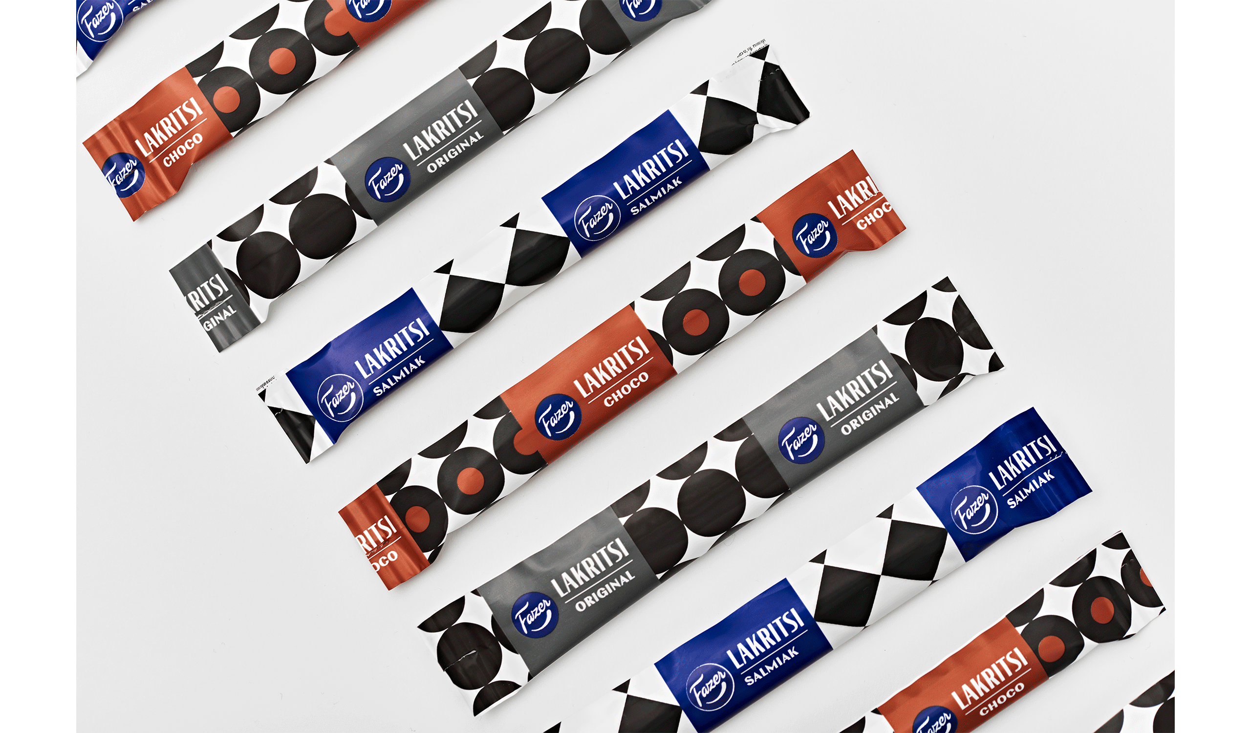
Fazer needed a new custom typeface to be used in packaging and advertising.
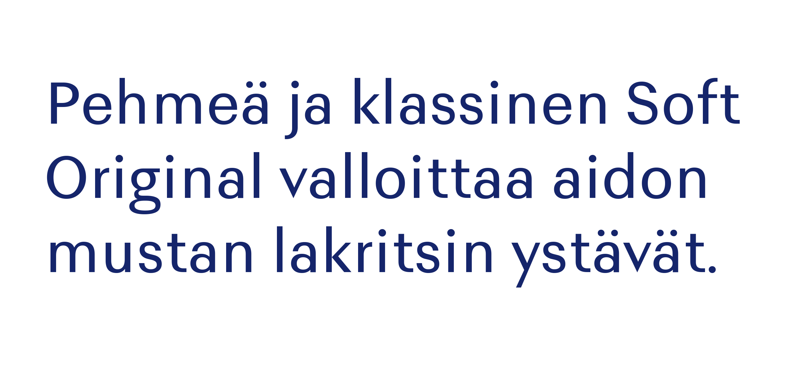
As a starting point we chose old Fazer posters from the 1940's and used that reference to create a new condensed high contrast sans serif display font. The end result is a typeface which seamlessly combines vintage aesthetics with modern execution. Perfect for a modern company with a long heritage.
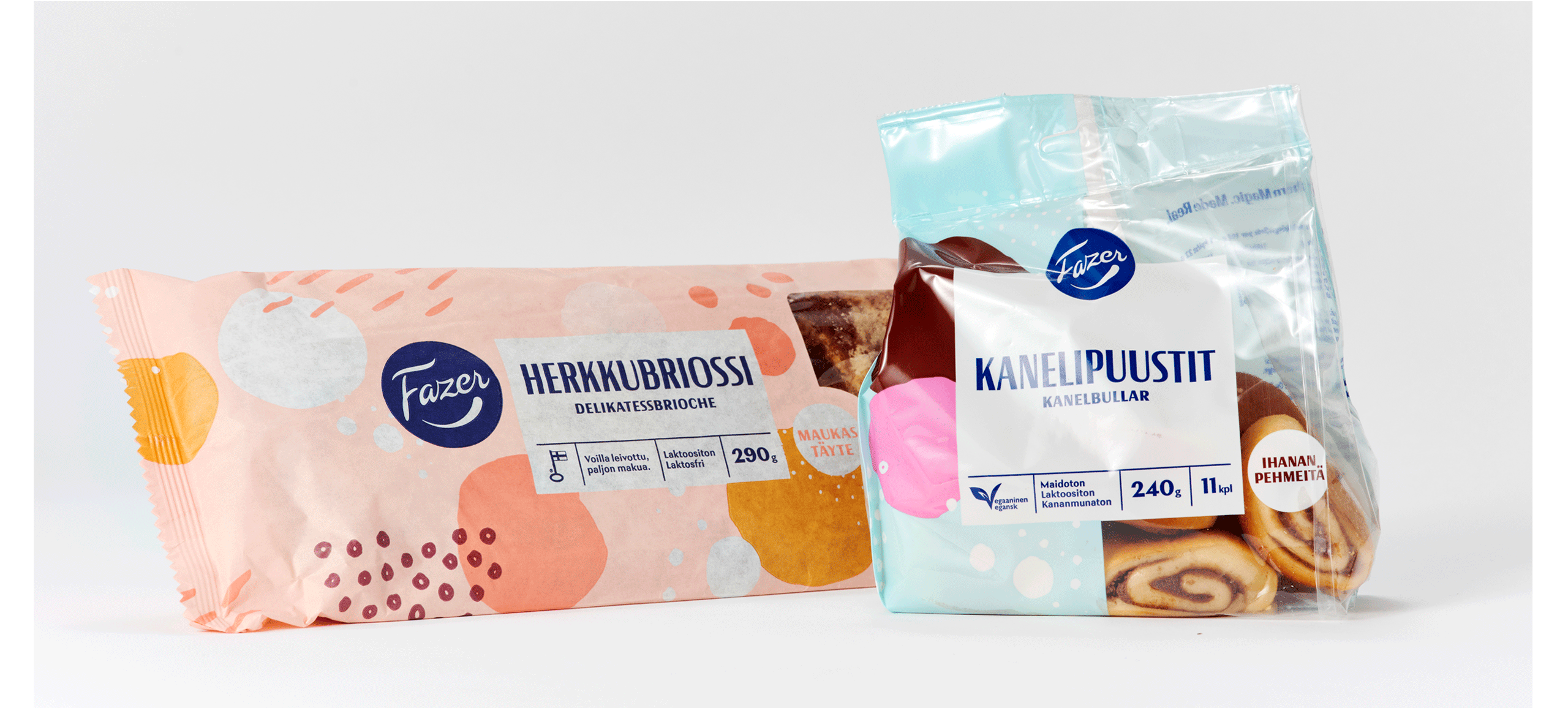
For longer texts we designed Fazer Text, which uses the same basic design principles, but is adapted to longer reading. The proportions are more regular, the terminal swell to balance the letters and the amount of styles is suitable for creating complex typographic hierarchy.
The typefamily supports Latin and Cyrillic scripts.
Fazer needed a new custom typeface to be used in packaging and advertising.
As a starting point we chose old Fazer posters from the 1940's and used that reference to create a new condensed high contrast sans serif display font. The end result is a typeface which seamlessly combines vintage aesthetics with modern execution. Perfect for a modern company with a long heritage.
For longer texts we designed Fazer Text, which uses the same basic design principles, but is adapted to longer reading. The proportions are more regular, the terminal swell to balance the letters and the amount of styles is suitable for creating complex typographic hierarchy.
The typefamily supports Latin and Cyrillic scripts.


CONTACT
teo@teotuominen.com
+358 503005654
CONTACT
teo@teotuominen.com
+358 503005654
CONTACT
teo@teotuominen.com
+358 503005654
CONTACT
teo@teotuominen.com
+358 503005654
SECTIONS
Retail Fonts
Custom Fonts
About